
WAR GAMES
A complete design process to reimagine a corporate gamification platform
Project type: Mobile app
Role: UX/UI Designer
Timeframe: 3 months
Tools: Figma · Whimsical · Maze · Miro
Context
Explore how gamification can enhance motivation and engagement in professional environments
Challenges
1/ Analyze an existing gamification platform to identify usability gaps
2/ Redesign the experience as a mobile application
Goal
Enhance Paradigma’s corporate gamification platform through a complete UX/UI design process
Research
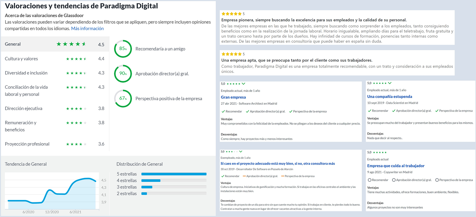
I started with desk research to understand gamification principles and how they were applied in Paradigma War Games, a Star Wars–themed program to boost employee engagement.
I asked myself: What makes this experience fun? And where could it fall short?
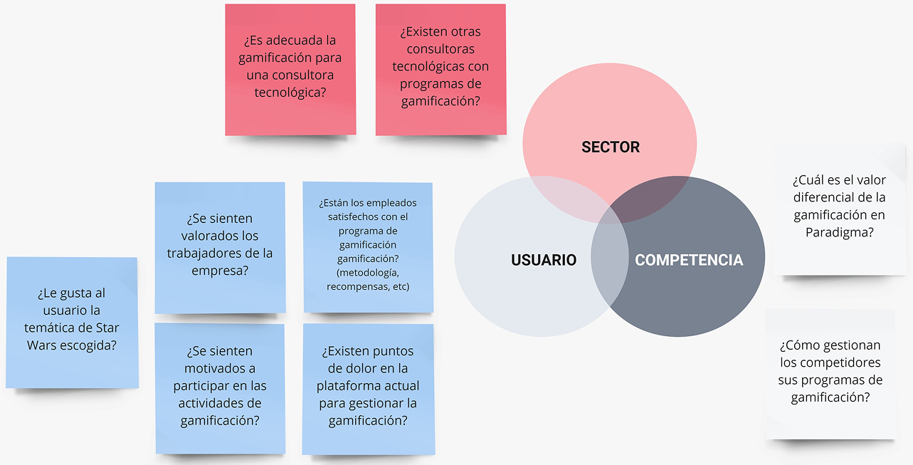
To see the program through employees’ eyes, I turned to netnography, reviewing online feedback to understand how people really perceived the enterprise and the game.
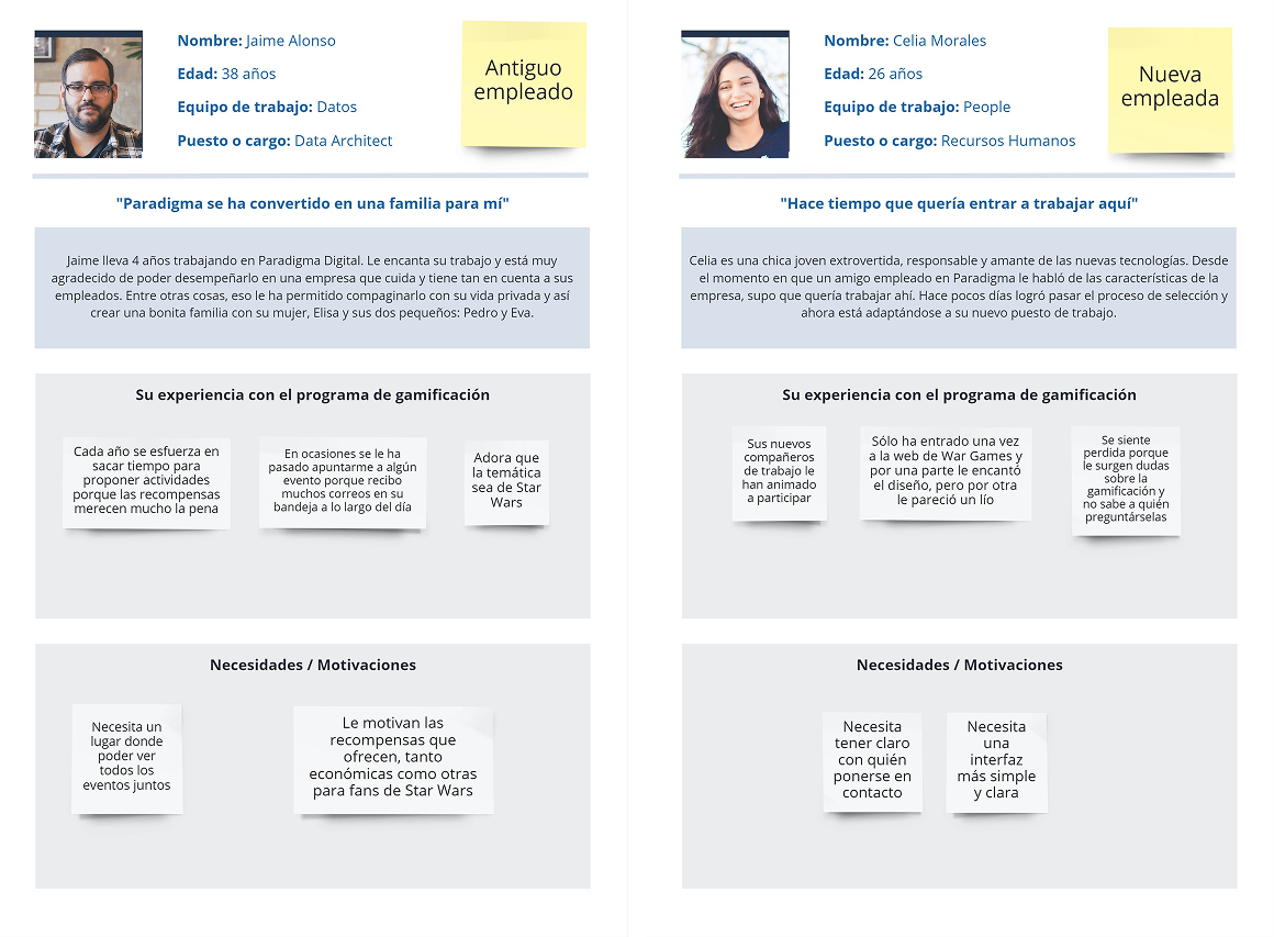
Then I went a step further with interviews, chatting with two employees to get firsthand stories and insights. These conversations helped me connect the dots between general patterns and individual experiences.
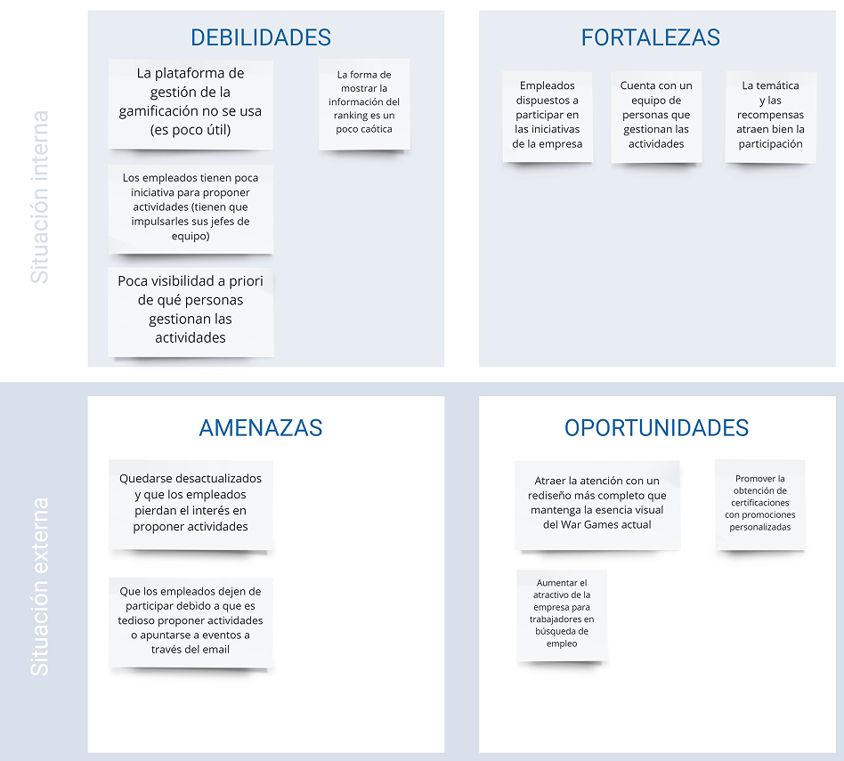
Finally, I summarized everything with a SWOT analysis. It confirmed that while the theme and content were engaging, the platform itself struggled with consistency, clarity, and unified management.
Empathize
To design a better experience, I needed to step into the users’ shoes and understand their needs, frustrations, and motivations. Here’s how I did it:
USER PERSONAS
I created two employee profiles (a new hire and an experienced employee) to capture different perspectives and motivations.
Who are they? What drives them? What challenges do they face in the program?
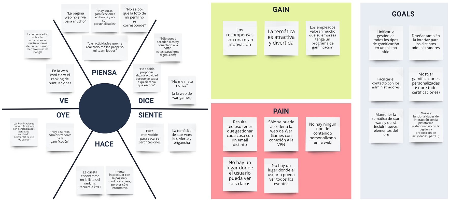
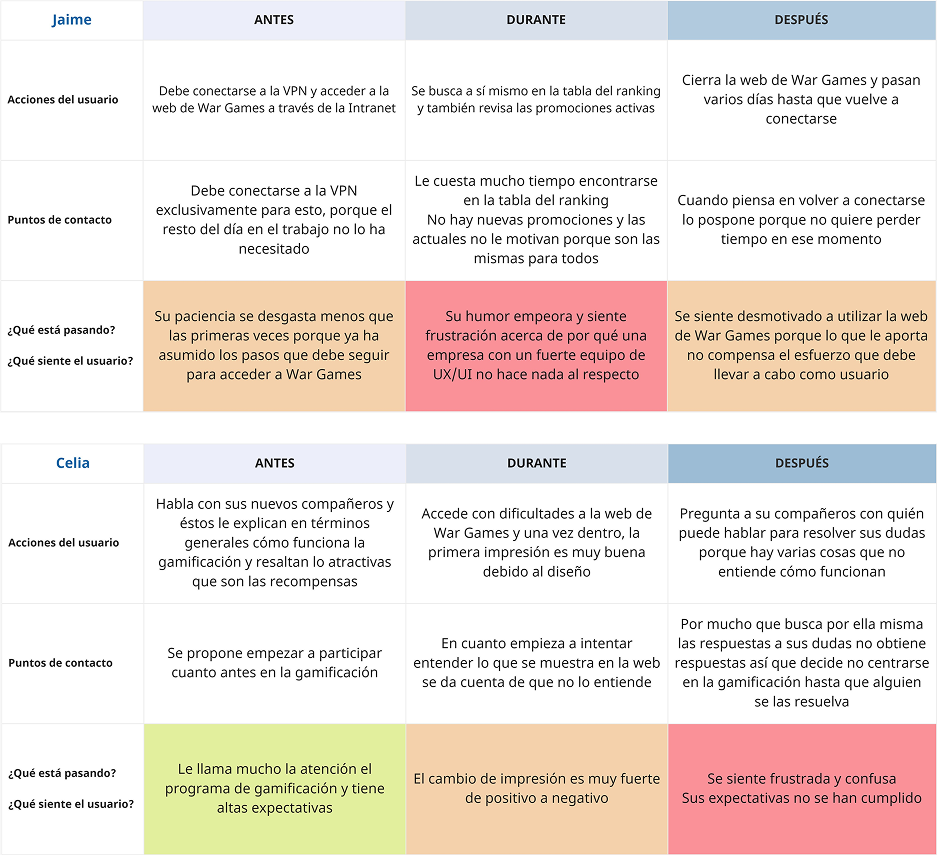
Empathy Map & Journey Map
I mapped out users’ thoughts, feelings, and actions. Initial impressions were positive, but the platform often caused confusion and friction. Seeing the experience from their point of view helped identify pain points to tackle first.
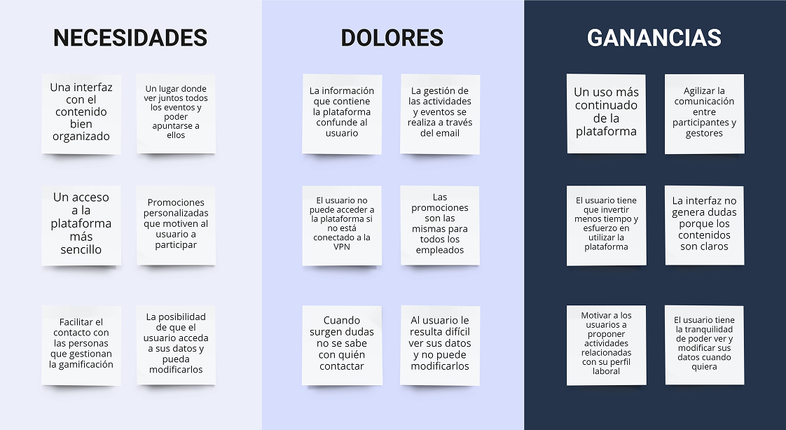
Needs Matrix
This exercise highlighted what users really wanted: a clearer information structure, personalized content, and handy features like an events calendar. It made me ask: What matters most to them?
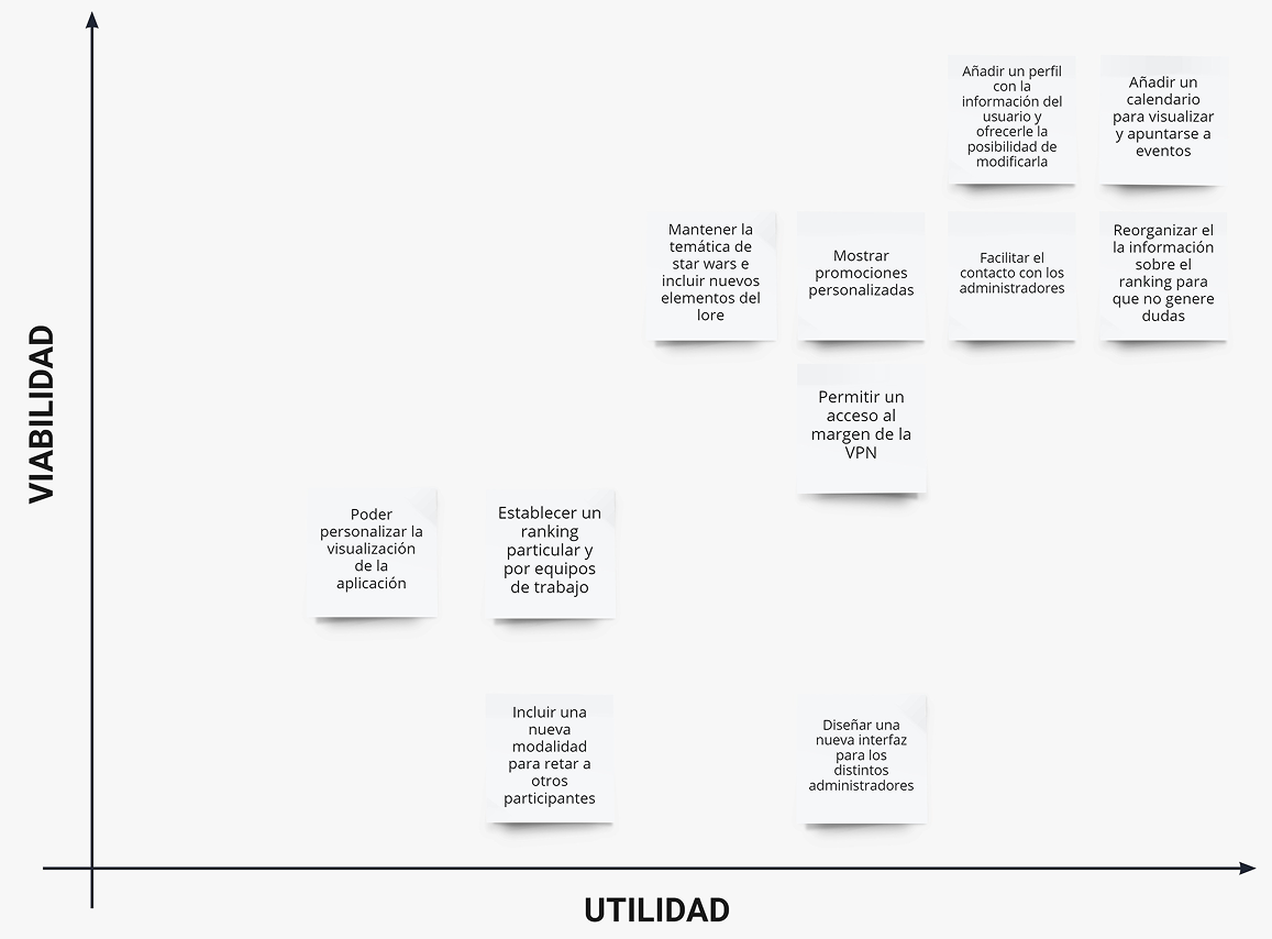
Utility & Feasibility Matrix
To decide which improvements to prioritize, I evaluated ideas based on utility and feasibility.
The most impactful and doable changes were implemented first, while others were noted for future iterations.
Define
After gathering all the insights from research and empathy exercises, I identified key findings that would guide the redesign of Paradigma War Games. These insights shaped the project’s main design opportunities.
- Gamification Program
- Platform
- Visual Design
Activity categories work well — their labels aren’t immediately intuitive, but users quickly get used to them.
Rewards are essential — they’re the main motivator driving users to propose and complete activities.
Badges boost engagement — users connect emotionally with the Star Wars–inspired characters. However, the badge icons could be redesigned to improve recognition and clarity.
Accessibility matters — users want to access the platform anytime, anywhere. A mobile app would make participation more fluid and natural.
Better structure, richer content — users need clearer information organization and new functionalities to keep engagement alive.
The retro video game look feels fun and aligns with the company’s geek culture, but it doesn’t fully reflect Paradigma’s professional brand image.
Keep the playful style, but refine it with a cleaner and more sophisticated aesthetic.
Revisit the color palette to better align the platform with Paradigma’s brand identity.
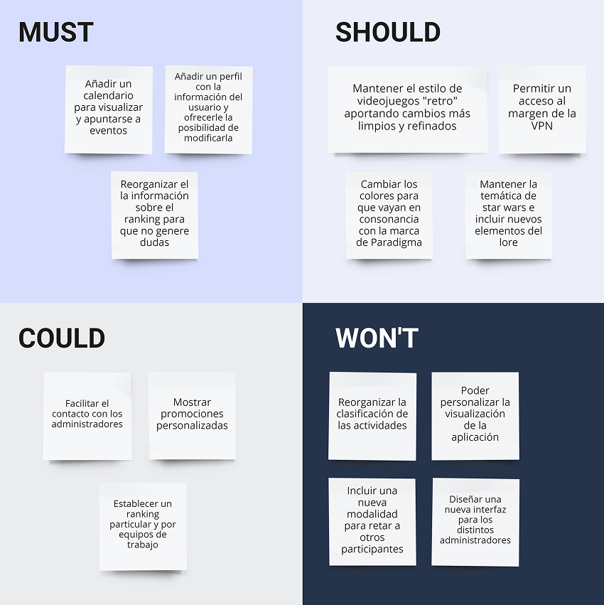
To prioritize the ideas I had collected, I used the MoSCoW method. This helped me focus on the changes that would have the biggest impact.
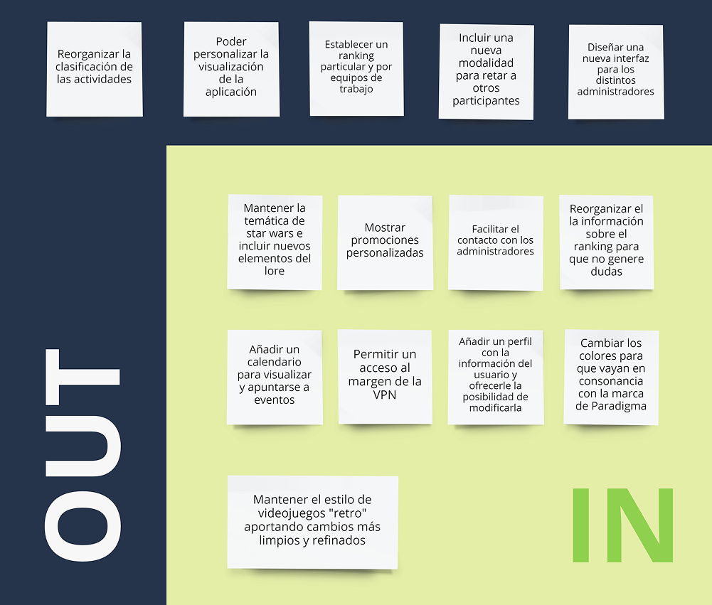
With priorities in place, I used the In-Out exercise to make explicit which ideas to include in the redesign and which to leave out for now. This allowed me to concentrate my efforts on the most valuable features and avoid distractions from less critical ones.
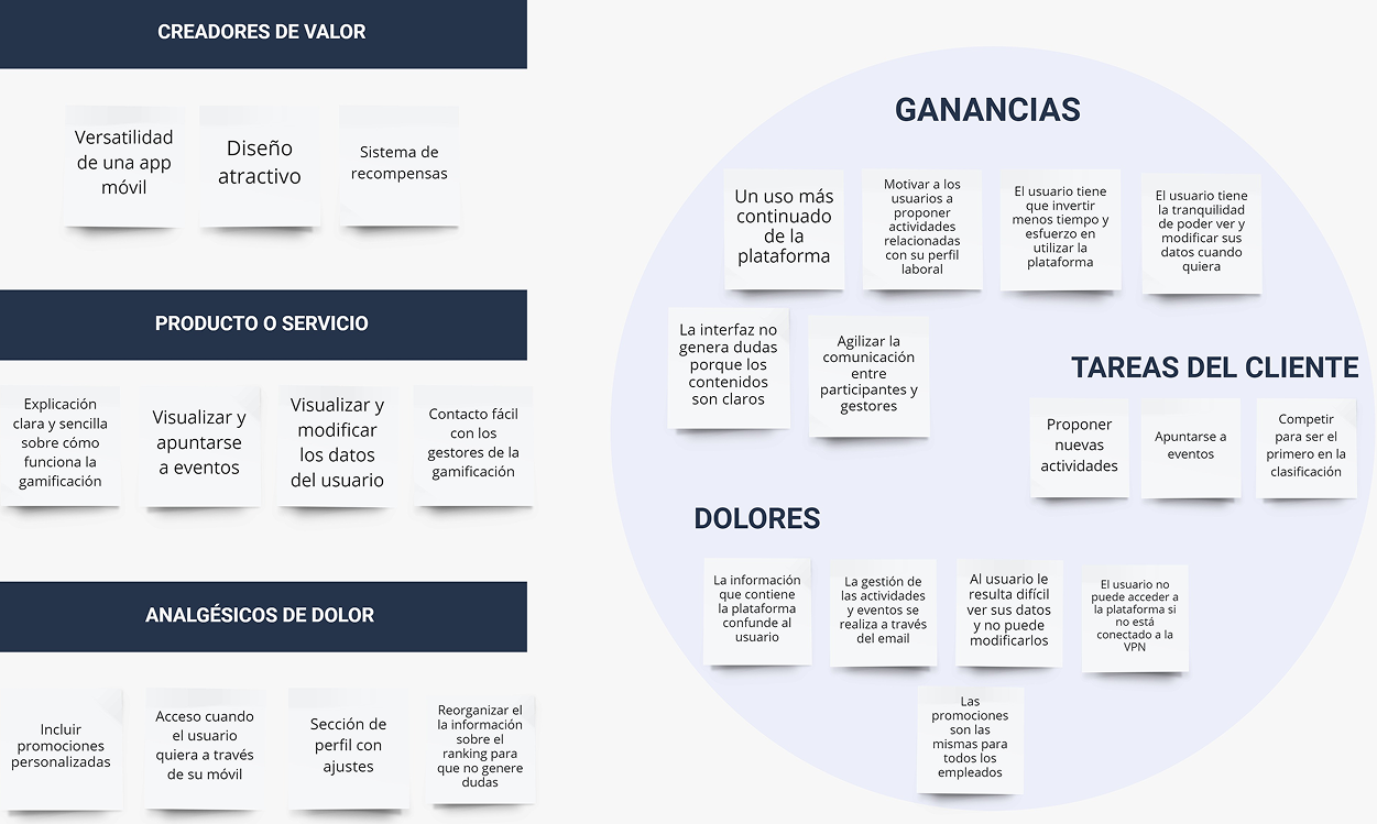
Next, I created a Value Proposition to clearly define the user’s goals and how the application delivers value. This exercise made it explicit why each feature matters, ensuring the redesign directly supports users in achieving their objectives.
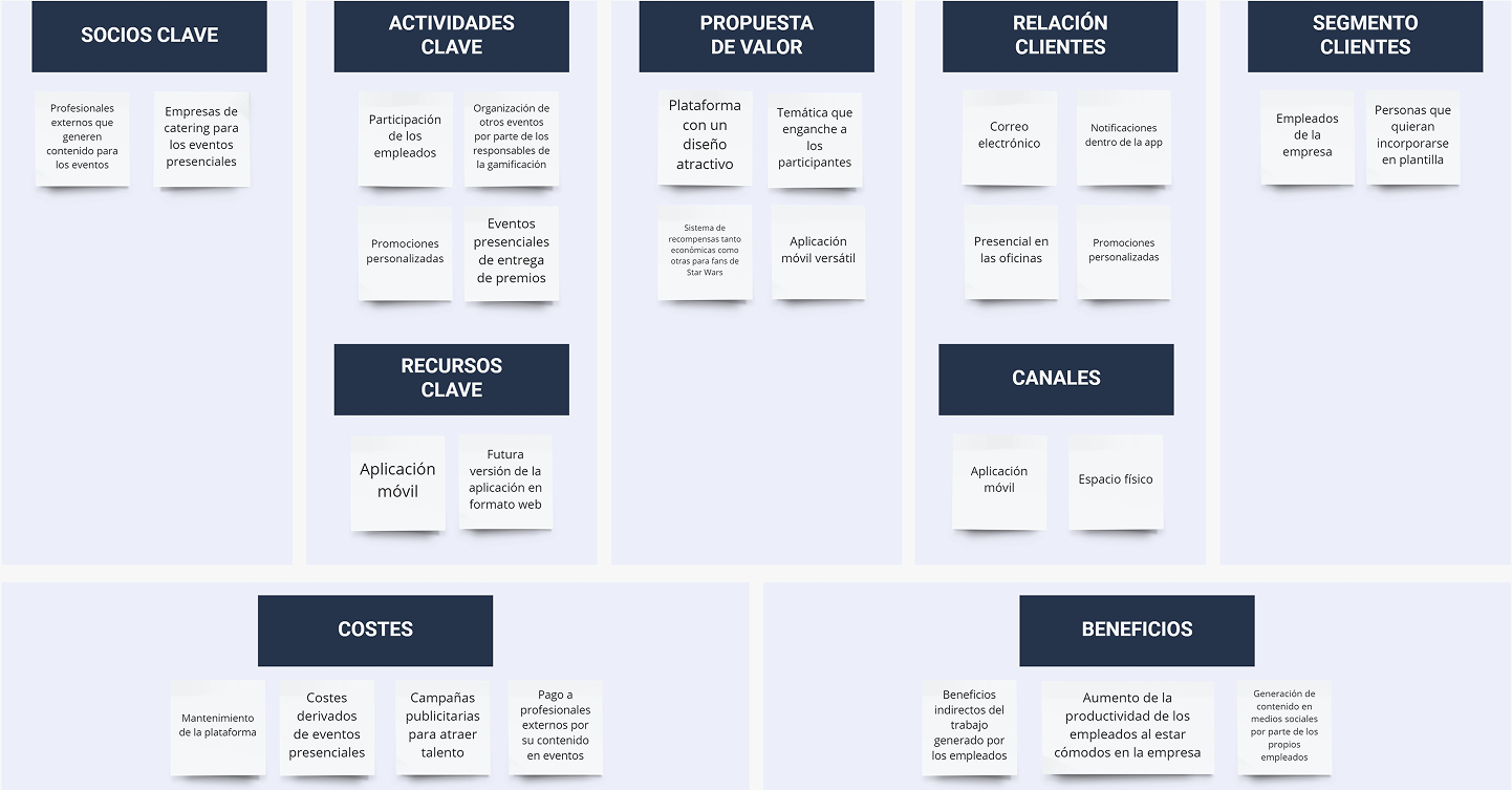
Finally, I analyzed the application from a business perspective using the Business Model Canvas. This helped me identify key areas, their current state, and where the redesign could have the most strategic impact. By linking user needs with business priorities, I ensured the project remained feasible and relevant.
Design
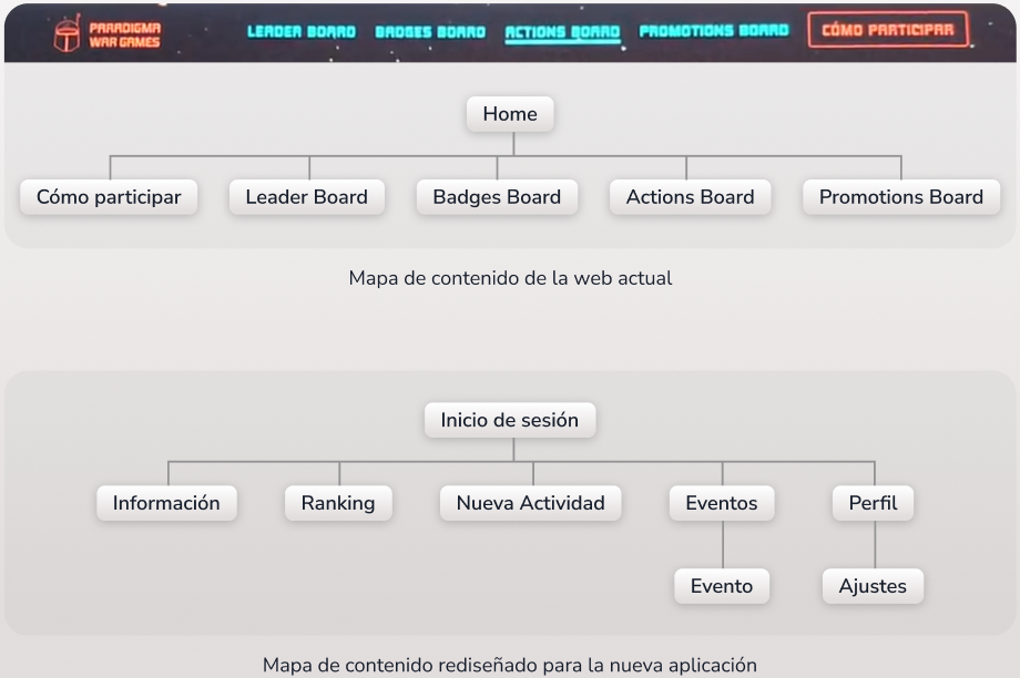
CONTENT MAP
The first step was organizing the app’s structure. I made significant changes compared to the current website, which is mostly informative and contains some redundant sections. The content map I defined includes:
- Login: the entry point to the app, restricted to employees.
- Information: the first section users see, explaining gamification, badges, categories, rewards, and participation instructions.
- Ranking: consolidates the former Leader Board, Badges Board, and Actions Board, allowing users to view, search, and filter the leaderboard.
- New Activity: a form to propose activities or claim points for participation, replacing the current email-based process.
- Events: a new feature where users can check current, past, and upcoming activities and sign up directly.
- Profile: shows points, attended/upcoming events, proposed activities, personalized promotions, and includes settings to edit personal data, profile picture, or log out.
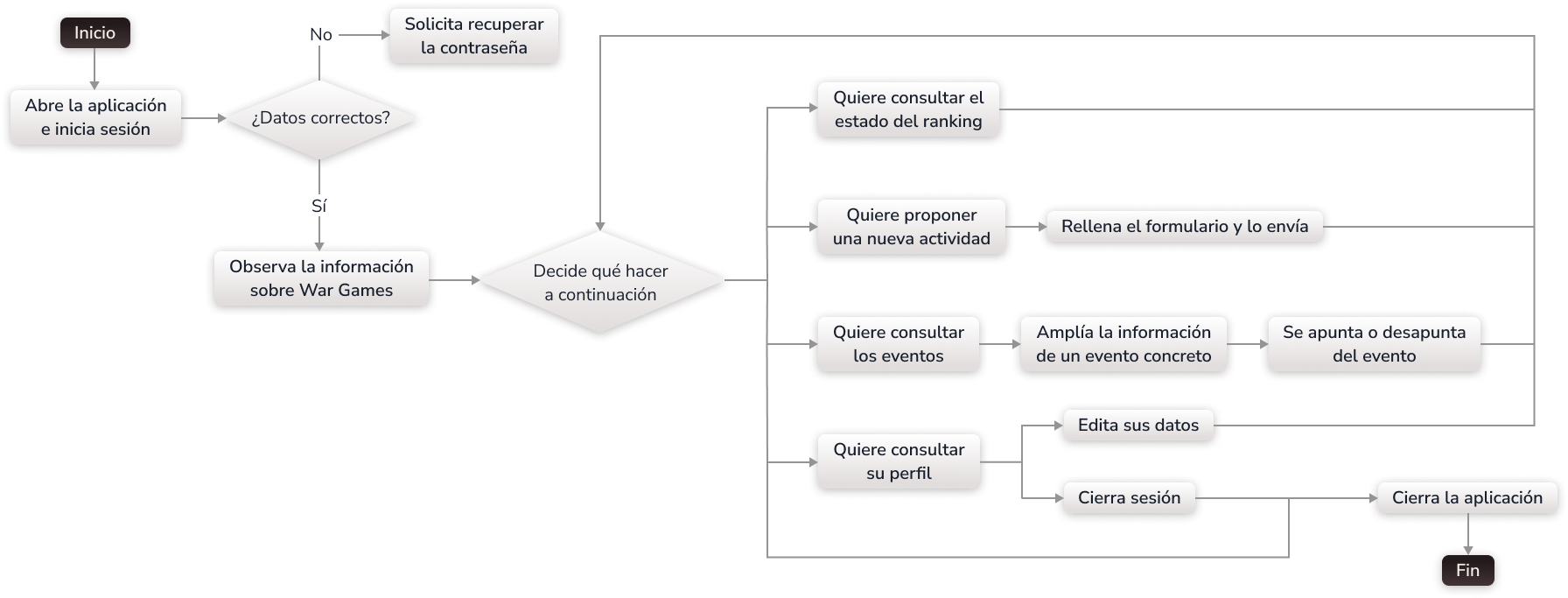
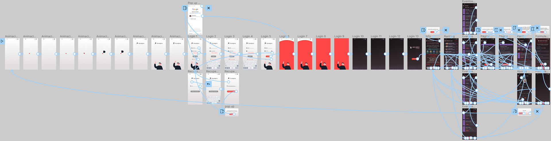
FLOWCHART
With the architecture defined, I mapped the user interaction flow to ensure intuitive navigation and smooth task completion.
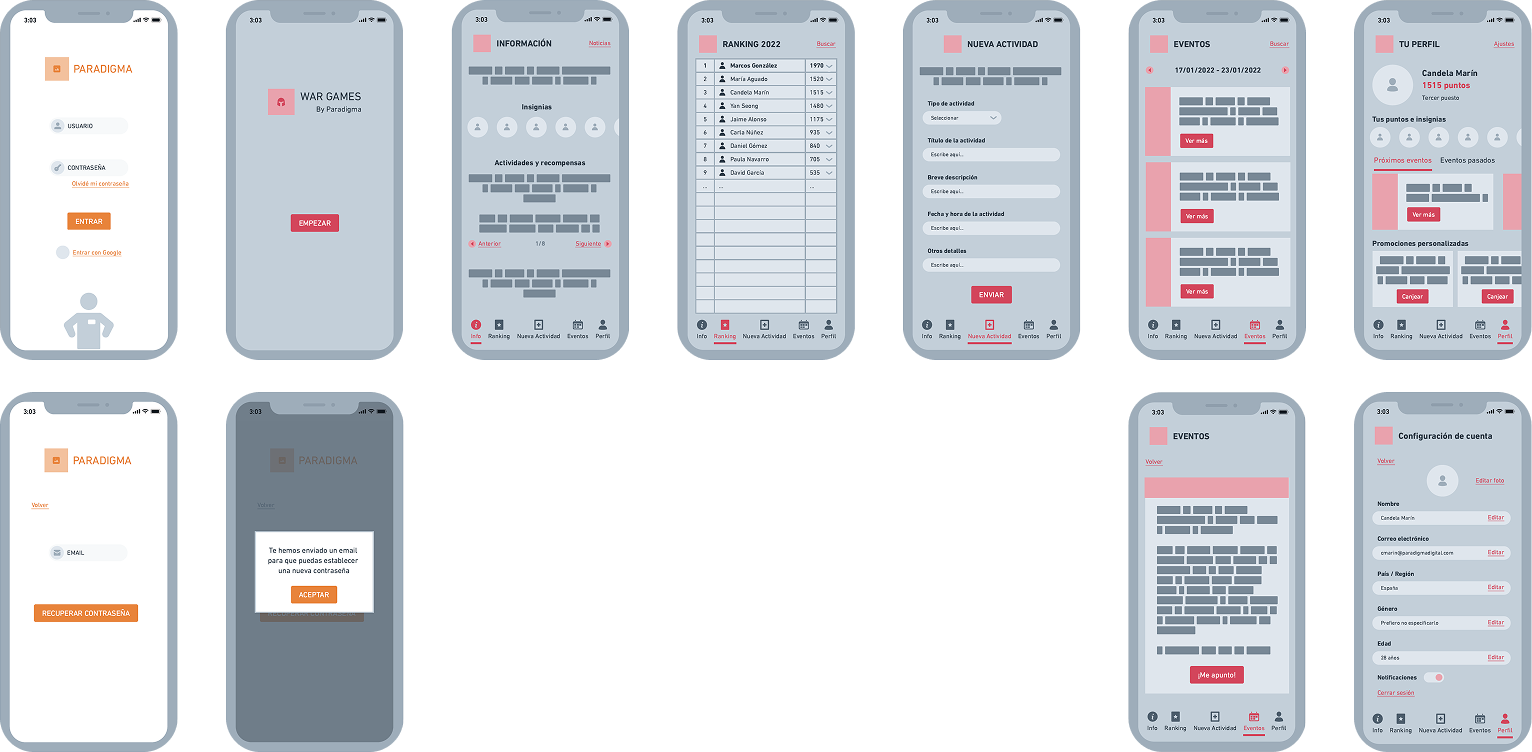
WIREFRAMES
Next, I visualized the layout of elements on each screen using Whimsical. Wireframes helped me test structure, hierarchy, and spacing before moving into visual design.
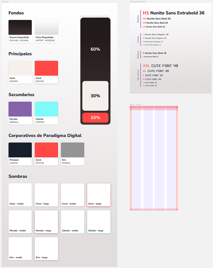
DESIGN SYSTEM
In the Figma file, the Style Guide Page defines the visual rules:
- Typography: fonts, sizes, and hierarchy
- Colors: primary, secondary, background, and Paradigma brand colors
- Shadows: to highlight elements and create a retro video game style
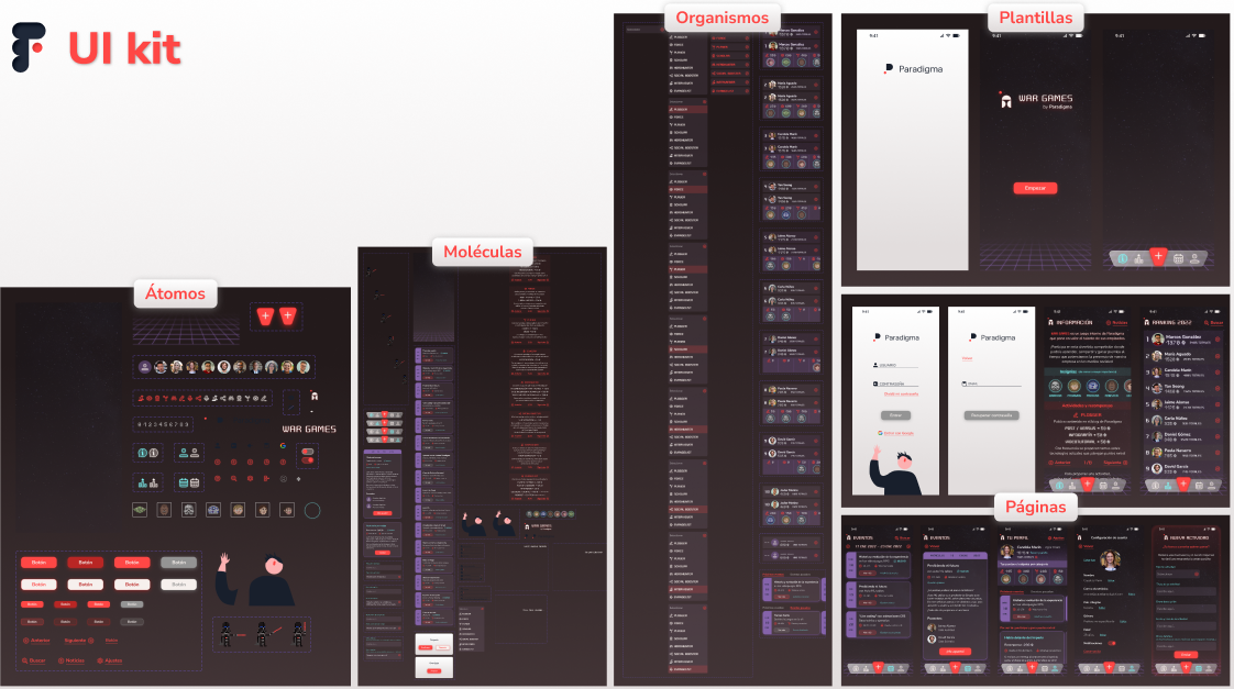
UI KIT
Following Atomic Design Methodology, components are organized in five levels: Atoms, Molecules, Organisms, Templates and Pages.
All components are available in the UI Kit layer of the Figma file, ready for reuse and scaling.
HI-FI PROTOTYPE
The high-fidelity prototype brings the app to life:
- Opening animation: a Flat-style illustration introduces the app while reflecting Paradigma’s brand identity.
- Login screens: branded screens for employee authentication, including Google login and password reset options.
- Transition animation: bridges the intro screens and the in-app visual style, featuring Paradigma’s slogan: “Tecnología con propósito”.
- Star Wars immersion animation: a well-known quote immerses the user in the theme.
- War Games module selection: currently the only module, featuring a Pixel Art Darth Vader, retained from the original website.
- Redesigned War Games screens: navigable via a bottom icon menu, presenting the new content and improved user experience.
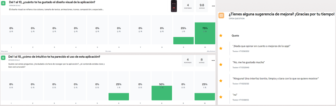
Testing
Once the high-fidelity prototype was ready, I tested it using Maze, gathering feedback from users outside the project. Although the sample was small, the responses were positive and encouraging.
KEY TAKEAWAYS
- The MVP, developed following the Design Thinking process within a Double Diamond framework, resulted in a complete application with well-organized content and an attractive interface.
- The visual style and interactions align with Paradigma’s brand identity.
- Initial feedback indicates a good user experience.
Next steps
While the initial prototype has been well-received, there are important steps ahead to ensure the final product truly meets user needs:
-
Deeper user testing
Engaging actual employees will provide richer insights, uncover potential friction points, and validate whether the redesigned flows and new functionalities deliver a seamless experience.
-
Iterative improvements
The prototype is just the starting point. Observations from further testing will guide refinements, prioritizing the most impactful changes while keeping the overall vision intact.
-
Expansion of functionality
In the future, additional modules could be added to support internal processes, such as employee training or engagement tracking, transforming the app into a more holistic tool for the company.
Impact
This section focuses on the value that the app could bring to the company and its people without overstating results that haven’t been tested in a real organizational context. By imagining the potential effects, I can highlight how design decisions translate into meaningful experiences for users and long-term benefits for the company.
From making participation more intuitive to aligning visuals with the company’s culture, the redesign points to opportunities for creating a platform that is both functional and enjoyable, with the power to enhance motivation, collaboration, and internal culture.
The app turns War Games into a lively, shared experience, transforming corporate gamification into a daily source of motivation
With badges, rankings, and rewards in one place, the app boosts recognition and keeps employees actively involved in company life
The new design balances Paradigma’s professional image with its playful, “geek” culture: a space that feels authentic and fun
War Games becomes more than a gamification tool by fostering collaboration and belonging across the organization
Reflection
Working on Paradigma War Games has been an incredibly enriching experience. As my first end-to-end UX/UI project, I faced the challenge of taking the design process from research to high-fidelity prototype entirely on my own. It was a journey of discovery, learning to balance user needs and business goals.
One of the biggest challenges was organizing complex content and workflows. The original website was mostly informative and contained redundancies, so I had to rethink the architecture from scratch. Creating a coherent content map, intuitive flows, and engaging interactions taught me how critical clarity and hierarchy are in designing a seamless user experience.
Another key learning was mastering tools and techniques across the UX/UI spectrum. From Whimsical wireframes to Figma design systems, UI Kits, and interactive high-fidelity prototypes with animations, I explored how each tool supports a specific stage of the process. Designing playful animations and intricate screens in Figma was especially rewarding because it made the app feel alive and real, and helped me understand the power of interactive prototyping in conveying experience before development.
Finally, this project trully reinforced my passion for UX/UI design. I remember spending hours on the visual interface, completely absorbed in the work. The time flew by, and I felt immense satisfaction and motivation. Seeing ideas come to life in a functional, engaging prototype solidified my conviction that this is the field I want to pursue, combining creativity, problem-solving, and user-centered thinking. Overall, Paradigma War Games was more than a project: it was a comprehensive learning journey that strengthened my design skills, problem-solving mindset, and confidence as a UX/UI designer.